
Why Beautiful Rooms Don’t Always Work
——The Hidden Psychology Behind Furniture Placement — and How to Fix It
By Clara Whitfield | Updated on March 2026 | 🕓 12–15 minutes
Key Highlights
- Beautiful rooms often fail because they’re designed for images, not real life
- Furniture placement is strongly shaped by cognitive biases (symmetry, anchoring, ownership)
- Overly “perfect” layouts can reduce movement, interaction, and comfort
- Negative space is not wasted — it enables flexibility and change
- Good design starts with behavior, not aesthetics
Most room design failures aren’t about bad taste.
They happen because we prioritize visual certainty over the realities of everyday living.
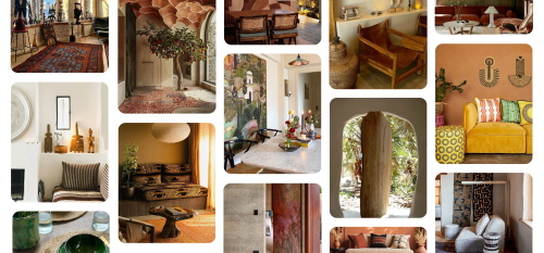
Have you ever saved a living room photo on Pinterest or Instagram, loved it for months, and finally recreated it exactly in your own home? A light gray fabric sofa pressed against the wall. A minimalist coffee table perfectly centered. A geometric rug neatly aligned underneath. Everything symmetrical. Everything flawless.
And then you move in.
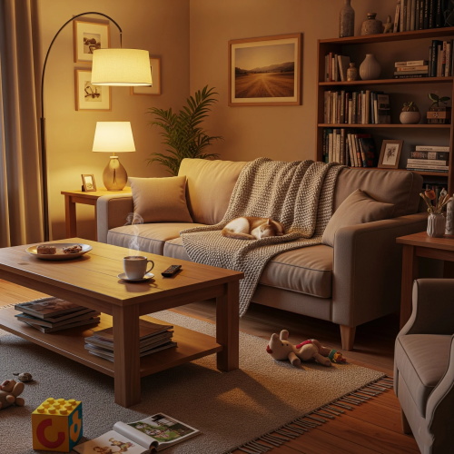
Suddenly, daily life turns into a negotiation with furniture. To walk from the sofa to the balcony, you have to angle your body around the sharp corner of the coffee table. When you try to talk with your family, everyone ends up staring forward at the TV, like strangers in a movie theater. You want to sit on the rug and build blocks with your child, but the oversized coffee table occupies all usable floor space. The photo looks serene. The family drifts apart.
What if the problem isn’t your aesthetic taste — but your psychology?
The way we design rooms is deeply shaped by cognitive biases. These mental shortcuts once helped our ancestors avoid danger and find shelter. Today, they quietly turn our homes into beautifully styled “prisons.” The issue isn’t style. It’s how our brains trick us.
Five Psychological Biases That Shape Your Room
1. The Pinterest Bias: Designing for Images Instead of Experience
We live in a world saturated with social media imagery. When scrolling through Pinterest, our brains gravitate toward static visuals and centered compositions. We like sofas against walls because they make rooms look larger in photos. We like coffee tables centered because they anchor the image.
But this “Pinterest-ified” design ignores the fourth dimension: time.
Life is dynamic. Images are static.
When a room is designed to be seen rather than lived in, furniture becomes exhibition pieces. Circulation paths shrink into single-file corridors. Interaction becomes fixed by rigid layout decisions. Architect Sou Fujimoto once noted that social media has led us to believe good design is about appearance rather than feeling and function. The result? Your room looks beautiful in pictures, but you can barely move inside it.
Practical Correction: The 5-Minute Movement Test
- The Water Test: Pour a glass of water in the kitchen. Carry it to the living room, sit down, stand up, and walk back. If you spill water — or must consciously slow down to avoid furniture — your layout serves the eye, not life.
- The Two-Person Test: Walk side by side with another person through the living room. If one of you must turn sideways to pass, your space cannot support natural social density.
- The Extra Chair Test: Imagine a third guest arrives. Can you bring in a dining chair and integrate it within 10 seconds? If it requires maneuvering around obstacles, you’ve designed a photograph, not a home.
2. The Symmetry Bias: Why Order Feels Addictive — and Freezes Space
The human brain craves order. Neuroscience research shows that symmetrical patterns activate reward systems, generating feelings of calm and predictability. Symmetry signals stability — and stability once meant safety.
But when we impose that preference rigidly in our living rooms, we create a single-purpose “viewing zone.” Sofas face the TV. Chairs come in matching pairs. Every seat points forward.
This layout supports only one activity: passive watching.
It suppresses other possibilities — a deep conversation in a corner, quiet reading by a window. Recent research even suggests that while symmetrical architecture increases visual preference, it does not necessarily foster richer social interaction.
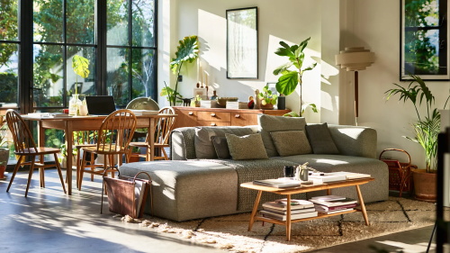
Practical Correction: Intentional Asymmetry
Break a single visual center — not to create chaos, but to release behavior.
- Offset the Sofa: Instead of centering a long sofa on the wall, shift it slightly to create a walkway behind it.
- Mix Side Tables: Replace a heavy matching coffee table set with varied sizes and materials.
- Create a Conversation Angle: Arrange two armchairs and a stool at 15–20 degrees toward each other, rather than pointing everything toward the television.
The goal isn’t disorder. It’s allowing conversation and viewing to coexist.
3. The Anchoring Effect: Why First Placement Shapes the Next Five Years
In cognitive psychology, the “anchoring effect” describes our tendency to rely heavily on the first piece of information we receive. In spatial design, the first day you move in — when you push the sofa against the wall — becomes the psychological default.
Large furniture, once placed, quietly determines the fate of the room for years.
But your life changes. Two years ago, you lived alone. Now you have a dog. Last year you hosted weekend gatherings. Now you work from home. Your needs evolve — but the anchored sofa doesn’t.
Studies show that even in coffee shops, people gravitate toward seats that feel sheltered, such as those against walls. The instinct for “back protection” persists.
Practical Correction: The Layout Reset Rule
The only way to escape anchoring is forced reset.
- Move the Largest Piece First: Try pulling the sofa away from the wall. Many people discover the room feels more spacious, not smaller. Circulation can move behind the sofa. Depth appears.
- 48-Hour Trial: Don’t judge immediately. Live with the new layout for 48 hours. Your body needs time to adapt.
- Photograph Your Movement: Notice your walking patterns. If you consistently avoid a certain area, that’s still a bottleneck.
4. The Fear of Empty Space: Why We Fill Every Inch
In psychology and art history, scholars describe “horror vacui” — the fear of empty space. From an evolutionary standpoint, open space meant vulnerability. Undefined territory could signal danger.
So we fill it.
Every wall gets artwork. Every corner gets storage. Every gap gets furniture. The result? Zero flexibility.
Want to do yoga tomorrow? No space.
Your child wants to build a train track? No space.
You buy a treadmill next year? Definitely no space.
A fully filled room cannot absorb change.
Practical Correction: The 15% Rule
Force yourself to leave 10–15% of the room as negative space.
- Deliberate Blankness: Leave one wall or one corner undefined. Don’t assign it a purpose yet.
- Use Mobile Solutions: Choose rolling carts or folding chairs instead of heavy built-ins. When needed, you can shift them instantly rather than dismantle the room.
Empty space isn’t waste. It’s stored flexibility.
5. The Endowment Effect: Why You Can’t Let Go of That Useless Cabinet
Behavioral economics describes the “endowment effect”: once we own something, we immediately value it more. Even touching an object increases perceived ownership.
That built-in cabinet? You keep it because it “came with the house.” That bulky custom unit? You keep it because it was expensive.
Ownership distorts judgment.
You might walk around a protruding storage cabinet every day simply because it exists. It may not fit your habits at all. But “built-in” feels non-negotiable.
Practical Correction: The Reverse Question
Look at that heavy cabinet or oversized sofa and ask:
“If this didn’t exist today, would I spend money to buy it — or would I feel relieved to have the extra space?”
If the answer is “I wouldn’t buy it,” you’re being held hostage by ownership bias. Value should be determined by current usefulness, not past cost.
The Shift: From Visual Design to Behavioral Design
Once we understand these biases, how do we redesign our process?
Adopt the mindset of a “space director,” not a graphic stylist.
Step 1: Movement First
Before choosing wall colors, observe your legs. Map your daily routes:
Wake → Bathroom → Kitchen → Exit.
Return → Drop bag → Sit down.
Do your furniture pieces obstruct these natural paths?
Step 2: Interaction First
Does your layout encourage connection?
Does it create corners for spontaneous encounters? A stool by the kitchen island for quick conversations? A seating arrangement that forms a conversational circle rather than rows facing a screen?
Step 3: Flexibility First
Can the room change function within five minutes?
Can the dining table become a workspace? Can the coffee table move aside for yoga? Mobility is the defining feature of resilient design in the next decade.
Step 4: Negative Space Check
Does the room breathe?
Where can children spread toys without immediate conflict? Where can you sit on the floor quietly with a cup of tea? If nowhere exists, the room is too full.
Truly good design isn’t flawless symmetry, total saturation, or rigid centralization. It’s the ability to absorb life’s unpredictability. It allows children to run. It allows friends to crowd into the kitchen. It allows you to drag the sofa toward the window one afternoon just to sit in sunlight.
A good room isn’t the one that makes you say, “How beautiful.”
It’s the one that, when you walk in, lets your body relax — and naturally leads you to the corner you love most.
That is the ultimate psychological answer.
FAQs
1. Why do rooms that look perfect online feel uncomfortable in real life?
Because online images are static, while real life is dynamic.
A Pinterest-style layout is optimized for symmetry, framing, and visual balance — not walking paths, interaction, or daily routines. Once people start moving through the space, carrying items, sitting down, or interacting, those “perfect” arrangements often become obstacles instead of support systems.
2. How much empty space should a room actually have?
A practical guideline is to leave 10–15% of the room as flexible or unassigned space.
This doesn’t mean leaving areas unused permanently, but ensuring at least one corner or zone can adapt — for play, exercise, extra seating, or temporary rearrangement. Without this buffer, rooms become rigid and unable to support changing needs.
3. Why does symmetry feel so important in home design?
Symmetry activates the brain’s preference for order and predictability, which is historically linked to safety and control.
However, in modern interiors, strict symmetry often reduces behavioral diversity — meaning people sit, move, and interact in fewer ways. While it feels calming visually, it can unintentionally limit how a space is used.
4. What’s the fastest way to improve a poorly designed room?
Start with large-scale movement changes instead of decoration:
- Move the largest furniture piece first (usually the sofa)
- Clear one circulation path completely
- Temporarily remove one bulky item
- Test the space for 48 hours before making final decisions
This “behavior-first reset” often reveals improvements that decoration alone cannot achieve.
References
1. Ariely, D. (2008). Predictably irrational: The hidden forces that shape our decisions. HarperCollins.
2. Kruglanski, A. W., & Gigerenzer, G. (2011). Intuitive and deliberate judgments are based on common principles. Psychological Review, 118(1), 97–109.
3. Leder, H., Tinio, P. P. L., & Bar, M. (2011). Emotional valence modulates the preference for symmetry in abstract art. Perception, 40(7), 845–853.
4. Tversky, A., & Kahneman, D. (1974). Judgment under uncertainty: Heuristics and biases. Science, 185(4157), 1124–1131.
5. Vartanian, O., Navarrete, G., Chatterjee, A., et al. (2013). Architectural design and the brain: Effects of ceiling height and perceived enclosure on beauty judgments and approach-avoidance decisions. Journal of Environmental Psychology, 34, 10–18.
About the Author
Dr. Elias Morgan, PhD
Dr. Elias Morgan is a behavioral design researcher and environmental psychology consultant based in Copenhagen. He holds a PhD in Environmental Psychology from the University of London and has worked with residential architects and urban designers across Europe and North America. His research focuses on how cognitive biases influence spatial behavior, domestic design, and everyday decision-making. His work bridges behavioral economics, neuroscience, and practical home environments.
Editorial Transparency Statement
This article is independently researched and written. It contains no sponsored content, affiliate links, or paid product placements. All referenced studies are publicly accessible academic publications or widely recognized scholarly works. The interpretations presented aim to translate established psychological principles into practical applications for residential environments.
Professional & Educational Disclaimer
This article is intended for educational and informational purposes only. It does not constitute architectural, engineering, psychological, or financial advice. Individual spatial needs vary significantly depending on household size, structural limitations, and personal circumstances. Readers are encouraged to consult licensed professionals before making structural modifications or major renovations.
Recommend for you:

Solid Wood, Engineered Boards, or Bamboo — What Actually Changes After Five Years of Living With Them
A Long-Term Look at Aging, Maintenance, Repairs, and Real-Life Use — Not a Material Ranking Guide
Wind, Dust, and the Urban Heat Island Effect: The Three Overlooked Killers of City Balconies
Severely Underestimated Variables in Urban Gardening: Nighttime Temperature Fluctuations
Microbial Ecology in Potting Soil Explains What Care Routines Cannot
Why Identical Balcony Plants Grow Differently Under the Same Water and Light
Smart Homes That Actually Reduce Stress — What the Research Says
The most common promise smart homes sell is “convenience” — doing a little less, so you can save a little more mental energy.